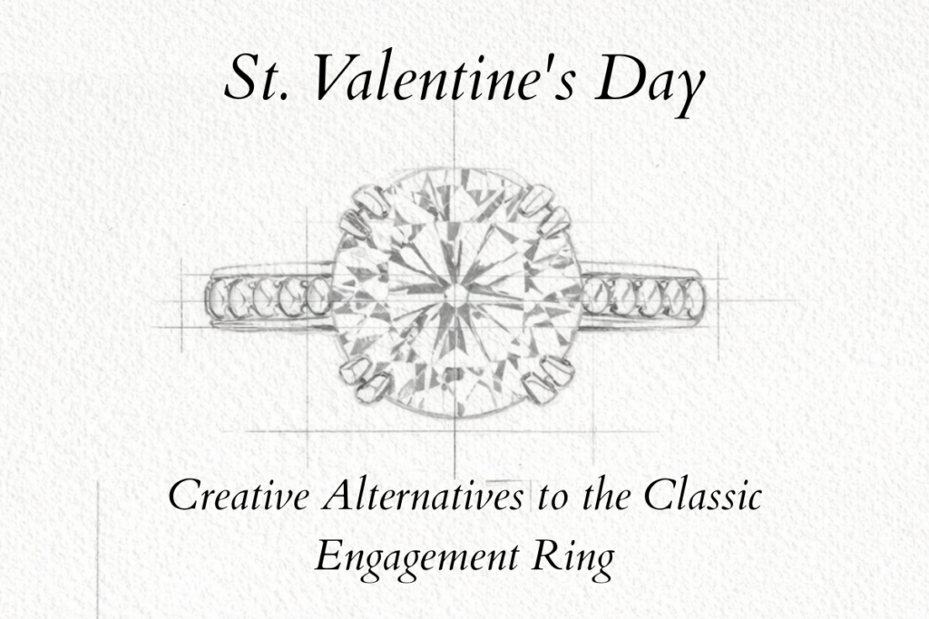
St Valentine — Creative Alternatives to the Classic Engagement Ring
A different way of saying yes, through colour, intention, and form.
I’ve always found Valentine’s Day slightly uncomfortable when it comes to engagement rings. Not because love shouldn’t be celebrated, but because it’s often reduced to a single visual formula. A diamond solitaire. White metal. Predictable proportions. As if commitment could only take one shape.
But love, in real life, doesn’t look like that.
When someone comes to me looking for an engagement ring that feels true, I don’t begin with size or value. I begin with the person who will wear it. Every piece of jewellery, at least in my eyes, should say something specific about the individual it belongs to. No two people carry themselves the same way. No two stories move through life in the same rhythm.
So I ask questions. About her character. About the colours she’s always been drawn to, often long before she could explain why. About how she lives, how she moves, what feels natural on her hand. Sometimes I ask about moments—shared memories, private symbols, quiet meanings that the person commissioning the ring wants to embed into it. Not in an obvious way, but in a way only the two of them need to understand.
Colour becomes a language here. It holds memory, temperament, and intention. When chosen with care, it turns a ring into something more than a beautiful object. It becomes a reflection. A small, wearable truth.
This is why, around Valentine’s Day especially, I like to talk about my alternatives to such a classic piece of jewellery. Not trends. Not boring copycat rings. Just other ways of expressing permanence—through stones that carry warmth, nuance, and character. Through cuts that respect colour instead of overpowering it. Through designs that feel classic at first glance, yet unmistakably personal once you look closer.
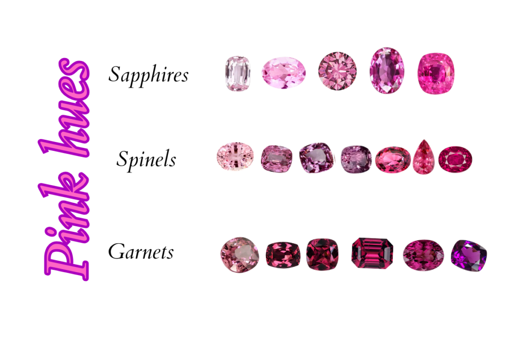
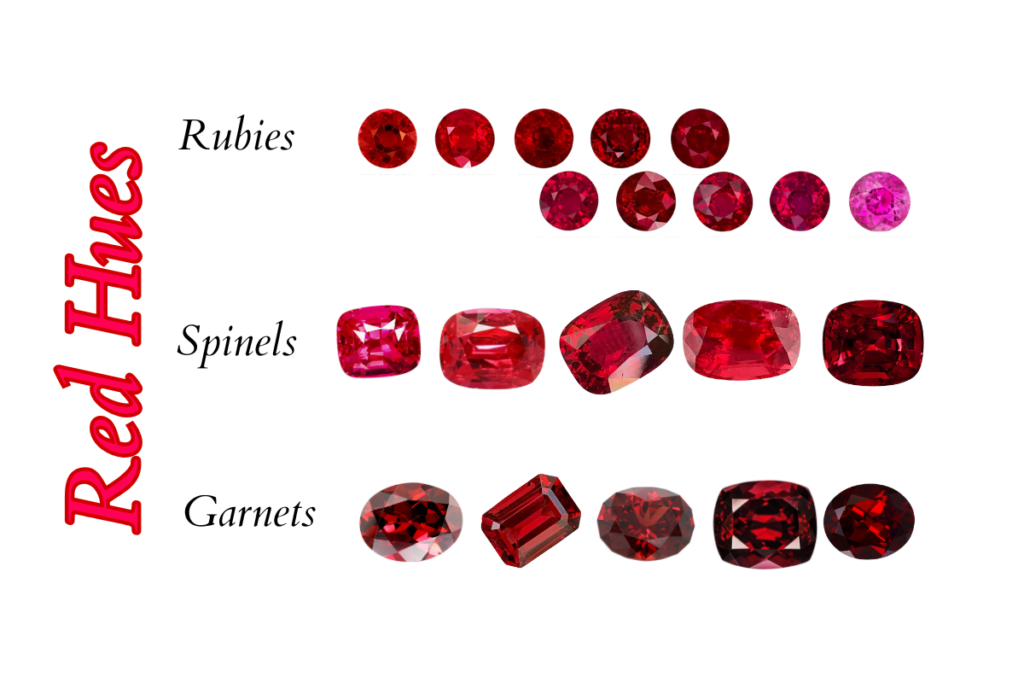
Pink hues — softness with structure
Pink is often misunderstood in jewellery. It’s associated with sweetness or fragility, when in reality the most compelling pink gemstones carry tension. Depth. Sometimes even a quiet imposition of presentce.
Spinels
Spinels are a natural starting point. Fine pink spinels don’t shout. Their colour is clean, often cool-toned, sometimes leaning toward rose or light crimson. What I love most is their consistency under different light sources. Pink spinels have a presence that’s difficult to explain unless you’ve spent time with them in your hands. Their strength comes from something technical but deeply felt: their monorefringence, the same optical behavior found in diamonds. Light moves through them cleanly, without doubling or distortion. What you see is what the stone truly is. That quality gives them an unusual sense of honesty.
They are my favourite stones of all. Direct. True. Powerful. And yet never loud.
A fine pink spinel doesn’t rely on flashes or dramatic shifts to make an impression. Its colour stays composed—often cool, sometimes moving toward rose or soft crimson—holding its intensity with restraint. There are many variables at play: hue, saturation, depth, cut. Each stone carries its own balance, its own personality. No two are ever identical.
That is precisely why I love them for engagement rings. They carry strength without aggression, elegance without effort.
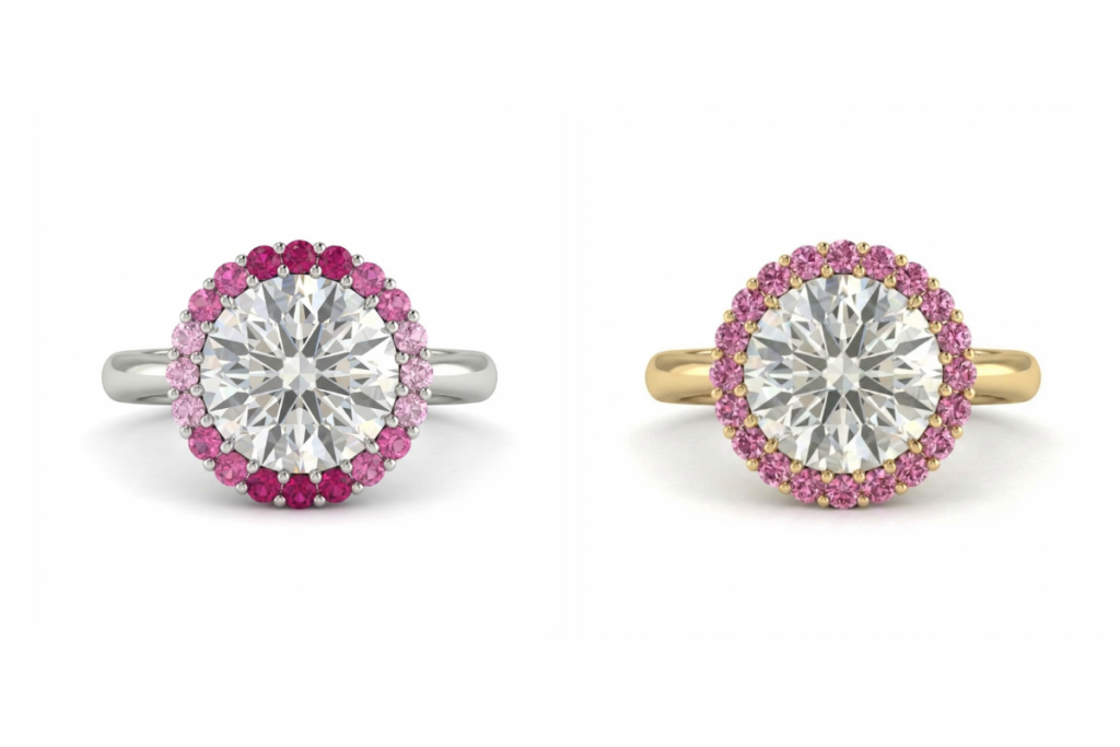
Pink sapphires
Pink sapphires sit at the intersection of strength and refinement, but their appeal goes far beyond structure. They carry a quiet romanticism that feels timeless rather than sentimental—a natural choice for a love meant to endure. Their crystal structure gives them physical firmness, which translates visually into crisp edges and balanced reflections, yet their inner world is often softened by silk inclusions.The pink is delicate and intense at the same time, creating a very delicate light and allure.
Those fine, needle-like inclusions diffuse the light gently, giving the stone a softer presence, almost a breath beneath the surface. It’s what makes a pink sapphire feel alive, capable of speaking without raising its voice. Sweet, composed, and deeply romantic, they embody an idea of love that is constant, patient, and sincere.
A well-cut pink sapphire never feels ornamental. It feels architectural in form, but emotional in spirit—a rare balance. For engagement rings, they represent an eternal romantic love that is tender without fragility, delicate without weakness.
Garnets
Pink garnets deserve far more attention than they receive, especially when intensity and presence are what you’re looking for. African garnets—particularly malaya garnets and rhodolite garnets—carry a depth of colour and fire that can be unexpectedly powerful. They are anything but delicate in character, even when their palette leans toward pink.
Rhodolite garnets, originally identified in East Africa, sit beautifully between red and violet. Their colour is never flat. A pink base is almost always crossed by a secondary tone—violet, raspberry, sometimes a darker wine note—that gives the stone weight and visual tension. Light doesn’t just bounce off the surface; it seems to move through layers, creating a sense of inner glow rather than overt brilliance.
If the goal is to create a ring that is eye-catching without being obvious, garnets are an under-the-radar choice with real impact. They suit those who are drawn to colour with substance—stones that carry emotion and intensity, but refuse anything sugary or superficial.
Pink stones in engagement rings are not a soft alternative to tradition—they are a statement.
Choosing pink is a deliberate act. It takes confidence to wear a colour that doesn’t hide behind convention or neutrality. These rings don’t blend in, and they are not meant to.
Pink carries presence. It draws the eye, holds it, and speaks clearly about individuality. When worn with confidence, it becomes powerful rather than delicate. These are rings for those who know who they are, who don’t need permission to step outside expectations. Pink doesn’t whisper. In the right hands, it stands its ground.
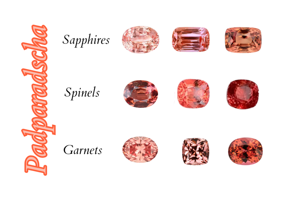
Padparadscha and in-between tones — the luxury alternative to diamonds
There are colours that resist definition. They sit between pink and orange, sometimes brushed with salmon, sometimes closer to lotus flower. They don’t resolve into a single name, and that ambiguity is exactly what gives them power. These are the stones that slow conversations, not because they are loud, but because the eye needs time to understand what it is seeing.
Padparadscha sapphires
Padparadscha sapphires are the most refined expression of this palette. Their rarity matters, but it is not the point. What defines a true padparadscha is balance. When pink and orange exist in the right proportion, the colour feels alive without tension. There is a softness to their glow, created by fine silk inclusions that diffuse light rather than sharpen it.
In daylight, padparadscha sapphires tend to look quiet, sometimes even restrained. As the light changes, warmth comes forward gradually. It’s not a flash or a sudden shift, but a slow release of colour from within the stone. The glow feels internal rather than reflective.
That behaviour is what makes them particularly suited to an engagement ring. They don’t demand attention in every moment, but they reveal themselves over time. Subtle, present, and deeply personal.
Spinels
Spinels in these in-between hues bring a different kind of clarity. Thanks to their monorefringence—an optical behaviour shared with diamonds—light travels through them cleanly and directly. There is no doubling, no visual distortion. When a spinel sits between pink and orange, its colour reads with precision. Edges remain crisp, saturation feels controlled, and the stone holds its identity in every lighting condition. These spinels often echo padparadscha tones, but with a more contemporary expression. They feel modern not because they try to be different, but because they are exact. Honest. Unfiltered.
Garnets
Malaya garnets complete this spectrum with intensity and fire. Sourced primarily from Tanzania and Kenya, they are more accessible than many other rare gems, yet remain significantly rarer than most garnet varieties found on the market. Their colour often shifts gently—peach in one light, copper-pink or rose-orange in another—driven by their complex chemistry. Unlike sapphires or spinels, malaya garnets don’t smooth the light. They energise it. There is movement inside the stone, a liveliness that feels raw and expressive. This intensity makes them particularly compelling for those who want warmth with presence, colour with emotion.
Padparadscha and its neighbouring tones speak a different language. Their colour sits between pink and orange, recalling dusk and sunset—when light softens, but depth increases. It’s a moment defined by transition, not contrast, and that is exactly what gives these stones their character.
They represent a form of luxury that doesn’t depend on diamonds for validation. Their colour is immediately recognisable, their presence self-sufficient. Choosing a padparadscha is a deliberate decision to make a statement through colour—controlled, precise, and confident—without leaning on convention.
For engagement rings, padparadscha stones offer a clear alternative: expressive without excess, distinctive without trend. They stand apart naturally, while remaining grounded in timeless proportion and balance.
Red — the burning passion
Red is the most demanding colour in fine jewellery. It offers no forgiveness. It exposes excess, imbalance, and exaggeration immediately. In an engagement ring, red must be handled with restraint, precision, and intention. When it is right, it carries a gravity that few other colours can match.
Rubies
Rubies remain the reference point. Their authority comes not from fashion, but from permanence. A fine ruby holds colour with density and calm, especially when the red leans slightly darker rather than vivid or fluorescent. These deeper tones age beautifully on the hand and feel composed in daily wear. When selecting a ruby for an engagement ring, treatment matters. Many rubies on the market are heat-treated, which is widely accepted when disclosed, but untreated stones—especially with fine colour—carry a different kind of presence. They feel quieter, more grounded. A ruby doesn’t need symbolism added to it; it arrives already complete.
Spinels
Red spinels are, in my opinion, one of the most intelligent choices in contemporary fine jewellery. Historically overshadowed by rubies, they are now being recognised for what they truly are: independent stones with exceptional optical integrity. Their monorefringence allows colour to appear clean and unwavering, and in fine specimens—especially those known as Jedi red—the saturation is remarkable without becoming aggressive. These stones are increasingly sought after, and their value has been steadily rising over recent years as collectors and jewellers reassess their rarity and quality. A red spinel offers power without inherited mythology, making it ideal for those who want intensity without historical expectation.
Garnets
Garnets, particularly almandine and pyrope varieties, take red in a different direction. Their colour is deeper, more mineral, sometimes approaching wine or iron-rich earth. Rather than projecting light outward, garnets tend to absorb it, creating a sense of density and inner weight. This makes them especially compelling for those drawn to red, pure and deep.
Red stones in engagement rings are not about drama or cinematic passion. They speak of commitment that is deliberate and grounded, often protection. A choice made with awareness, symbolic and powerful to demonstrate eternal love.
Presenting our Icône Chromatique – the revolution of engagement rings.
For those who want something recognisable, yet refuse what has become predictable, I return to one design language with absolute conviction: the halo — a classic revolutionized by a modern, colorful twist.
Icône Chromatique was created in response to a market that has grown complacent. Endless variations of the same elevated solitaire, detached from the hand, detached from meaning. Rings designed to be seen, not lived with. I wanted to design a piece that restores intelligence to the engagement ring—one that is classic in its foundations, yet unapologetically assertive in its presence.
At the centre is a round cut. Balanced. Universal. A form that has endured for a reason. But unlike conventional solitaires, this stone is not lifted high above the finger. The setting is deliberately low. This is not an aesthetic compromise; it is a design statement. A low profile gives the ring gravity. It anchors the stone to the hand, creating a sense of strength and continuity rather than fragility. The result is a solitaire that feels bold without being careless, confident without being impractical. A ring designed to be worn daily, not removed when life begins.
The halo is where Icône Chromatique asserts its identity. Colour is not an accent here—it is the defining language of the piece. The design was conceived to support multiple chromatic compositions, many guided by the logic of the colour wheel. Warm against cool. Harmony against contrast. Each combination shifts the emotional tone of the ring without altering its structure.
A diamond centre framed by pink, blue, violet, or orange sapphires creates entirely different expressions within the same form.
Aquamarine surrounded by yellow diamonds brings light and clarity with intention.
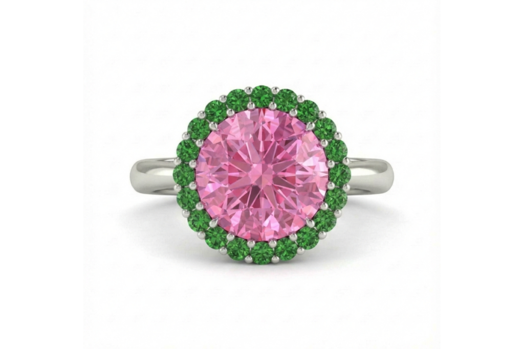
Pink sapphire encircled by tsavorites introduces tension—softness held by vitality.
Gradient halos, moving subtly from one hue to another, create depth and movement without symmetry or excess.
Every variation reshapes the character of the ring—quiet or expressive, warm or cool, intimate or striking—while the architecture remains constant. That consistency is its strength. Icône Chromatique is not trend-driven. It is a framework designed to endure.
This is a ring for those who want something classic, but refuse boredom. A piece that respects tradition, yet confidently redefines how an engagement ring should sit on the hand, feel in daily life, and represent commitment.
Bespoke colour — for those who choose intention over habit
Creating an engagement ring is not an exercise in originality. It is an exercise in clarity. The goal is not to stand apart for the sake of difference, but to arrive at a choice that feels unmistakably right. Materials, colours, and proportions are selected not to follow a market standard, but to reflect two people with precision.
At Valentina Leardi – Jewellery & Gemstones, bespoke design begins where most conversations never start: with colour. What feels natural to you? What has always been there? From that answer, the rest takes shape—stone sourcing guided by nuance, cuts chosen for how they hold light, proportions refined until the ring sits with confidence on the hand. These are decisions no catalogue can offer, because they require attention, judgment, and intent.
Working with colour demands conviction. Not noise. Not excess. The confidence to step away from formulas that have been repeated until they’ve lost meaning, and to choose something aligned instead. Something that holds presence without explanation.
These rings are not designed to appeal to everyone. They are designed to be right for someone. For those who value intention over habit, and precision over convention.
That is what transforms a ring into a commitment.