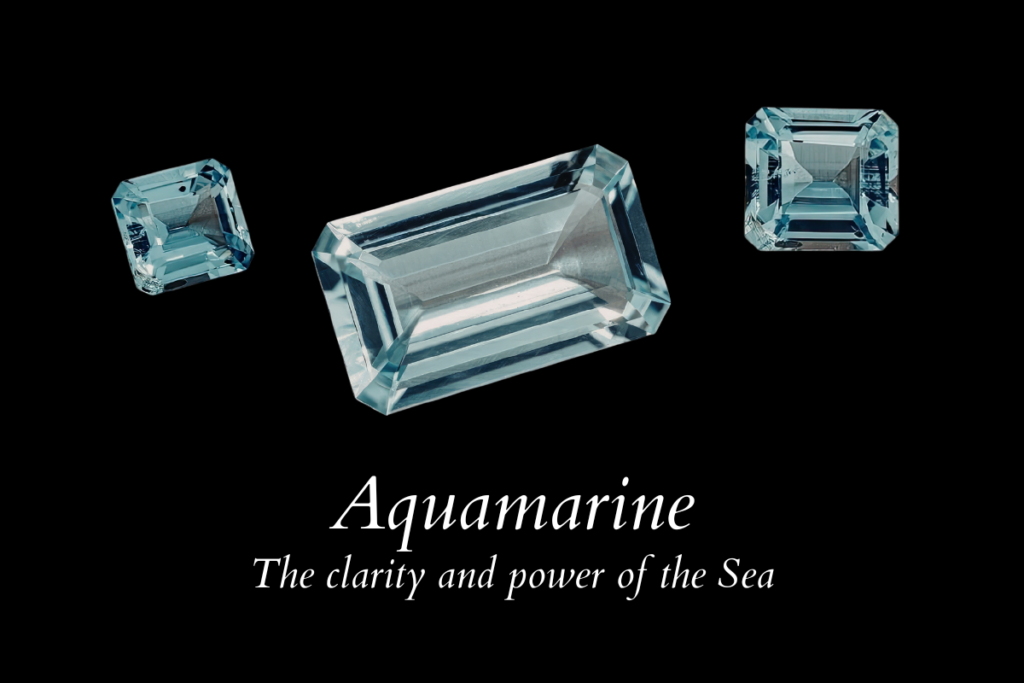
Aquamarine: The clarity and power of the sea
An honest study of origin, value, rarity, and what truly matters when buying aquamarine.
The first aquamarine I ever studied closely was not dramatic in the way people expect a blue stone to be. It wasn’t dark, and it didn’t flash aggressively under light. What caught me was something subtler. As I turned it under the window, the blue shifted — slightly greener from one angle, purer and clearer from another. That quiet change is pleochroism. Aquamarine does not show it loudly, but it is there, and once you see it, you cannot unsee it. The crystal carries more than one expression of blue within the same body.
For years it has been dismissed with the phrase “the diamond of the poor.” I have never agreed with that description. It is misleading. Aquamarine was never meant to imitate a diamond. Its value lies elsewhere — in its transparency, in the way light travels cleanly through it, in the calm authority of a well-cut crystal. In antiquity, it was not compared to diamonds at all. The Romans believed it protected sailors and calmed the sea. Medieval lapidaries associated it with foresight and clear speech. They saw in it what I still see now: not imitation, but clarity of mind and water.
Aquamarine is interesting because it doesn’t compete. It reveals. It asks you to pay attention to direction, to light, to orientation. It has character, but the character is disciplined. And that is precisely why I find it compelling.
Aquamarine is also the birthstone of March. I have always found that fitting. March is a transitional month — winter loosening its grip, light returning, the air still sharp but changing. Aquamarine carries that same quality. It is not the intensity of high summer blue. It is the first clear sky after cold. Historically, birthstones were chosen not only for color but for symbolism. Aquamarine was associated with renewal, protection during travel, and clarity of thought. It was believed to calm waters — literal and emotional. That symbolism remains relevant. It is a stone of composure.
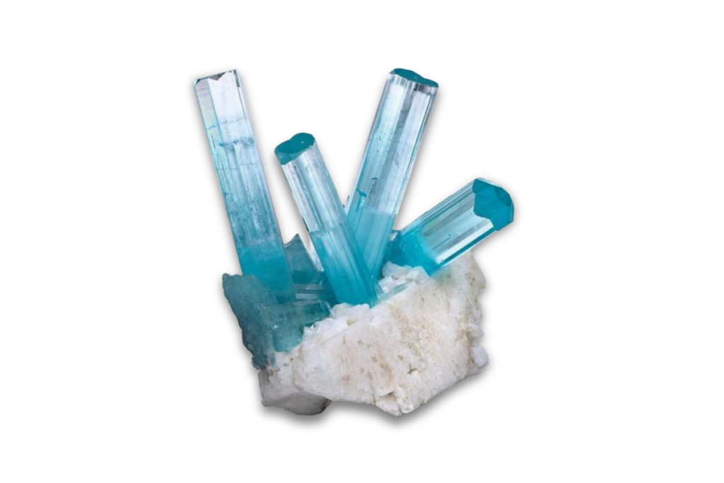
Aquamarine belongs to the beryl family, alongside emerald and morganite. Chemically, it is a beryllium aluminum silicate. Its color comes from iron within the crystal structure. Small changes in iron state shift the tone from greenish blue to a purer blue. The refractive index ranges around 1.577 to 1.583. On paper, that sounds technical. In the hand, it translates into a particular movement of light — linear, clean, disciplined.

Aquamarine Origins: Where the Most Prestigious Mines Are Located
Most aquamarine on the market comes from Brazil. Minas Gerais, Bahia, and Espírito Santo have produced some of the most important crystals ever recovered. Brazilian aquamarine is known for size and relative clarity. Large crystals form in pegmatite veins, often alongside tourmaline and feldspar. When Brazilian material is fine, it carries an open, oceanic blue that feels expansive rather than dense.
Pakistan is another source I respect deeply. The Shigar and Skardu regions, high in the Karakoram Mountains, have yielded crystals of remarkable transparency. Mining there is physically demanding — remote altitude, manual extraction, short seasonal access. The finest Pakistani stones show crisp, icy blue with exceptional internal purity.
Nigeria and Mozambique produce attractive material as well, often with slightly greener undertones. Madagascar offers stones from pale to medium saturation. Afghanistan’s Nuristan region has historically produced elegant crystals.
Prestige in aquamarine is not tied to one legendary mine in the way Kashmir defines sapphire. It is regional consistency that builds reputation. Minas Gerais carries historical weight. The Karakoram carries rarity of extraction. But origin alone never guarantees excellence. The stone itself decides.
The Historical Use of Aquamarine in Jewelry
Aquamarine has been present in jewelry since antiquity. Roman writers described it as a sailor’s stone, believed to calm the sea. In medieval Europe, it was associated with protection and foresight. Its hardness — 7.5 to 8 on the Mohs scale — made it suitable for carving and engraving.
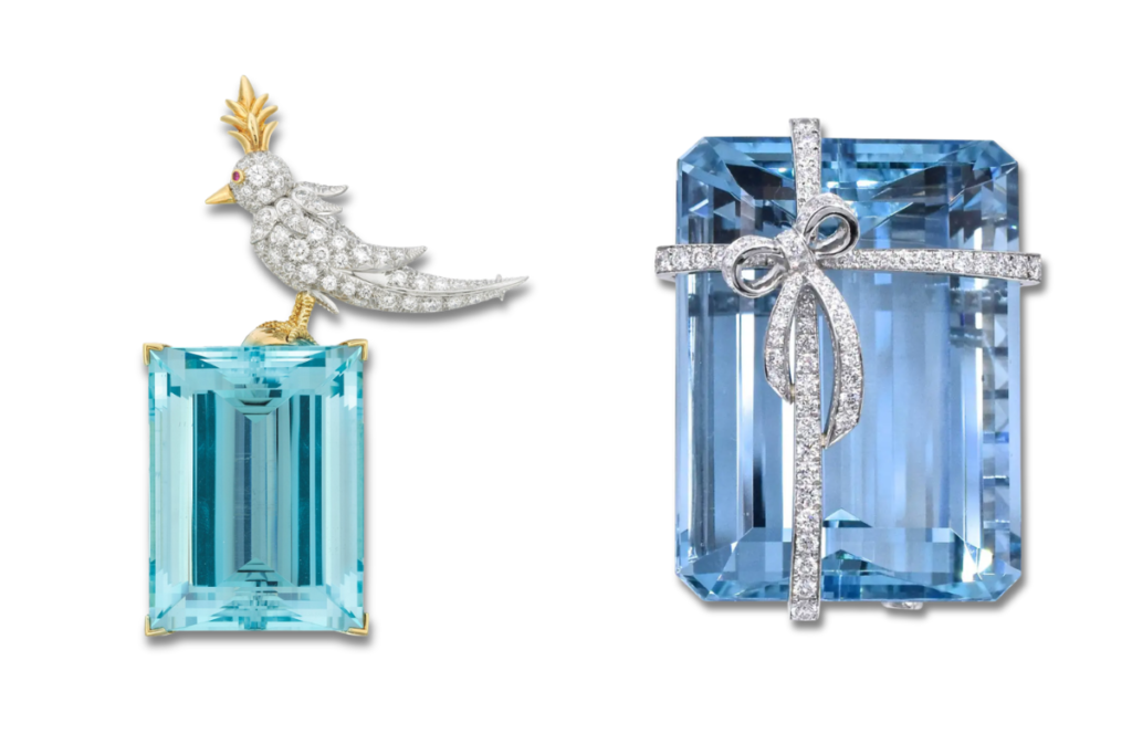
During the Art Deco period, aquamarine gained prominence in high jewelry. Designers favored it for its clarity and its ability to hold large geometric cuts without cloudiness. Step cuts and emerald cuts suited it particularly well.
In the mid-20th century, it became known for substantial cocktail rings — large, architectural stones set in structured mountings. Its relative accessibility compared to sapphire allowed designers to work at scale.
One of the most referenced modern royal aquamarines is the Brazilian aquamarine tiara gifted to Queen Elizabeth II in 1953. The stones were large, clear, unmistakably Brazilian in tone. The message was composure.
Aquamarine Treatments: What You Need to Know
Almost all aquamarine on the market is heat treated.
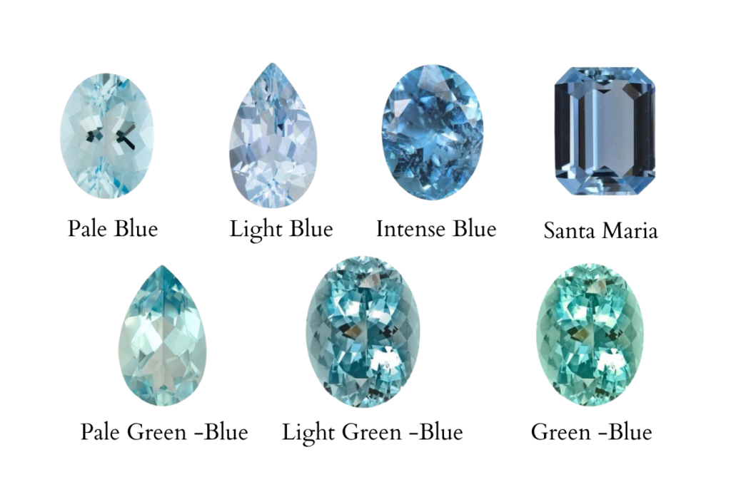
Natural aquamarine often forms with a greenish-blue tone. Gentle heating — typically between 400–450°C — reduces the green component and enhances the purer blue. This process is stable and widely accepted in the trade.
Untreated aquamarine exists, but vivid untreated blue is less common. Many untreated stones show a subtle green cast. For some collectors, that is desirable.
Fracture filling and surface coatings are not standard in fine aquamarine and should be approached carefully. When value is significant, laboratory confirmation from institutions such as GIA or SSEF is appropriate.
Transparency builds trust. I always disclose treatment, even when it is standard.
Is Aquamarine Rare?
Aquamarine is not rare in the geological sense. Large crystals can form and are commercially available.What is rare is balance.
Strong and even blue saturation. High clarity. Proper orientation during cutting to maximize color. No windowing.No gray undertone.
Many stones are pale. Many are large but watery. Many are cut too shallow or too deep to retain optimal face-up color. When I find a stone that holds color evenly across the entire surface under daylight, I take notice. That combination is less common than marketing suggests.
Aquamarine Sourcing 101: What to Look for When Buying
When I source aquamarine, I begin with color. Not origin. Not certificate. The actual color.
1. Evaluate Color in Natural Light
Move away from showroom lighting. View the stone near a window.
Look for an even blue that does not collapse into gray.
Check for zoning — uneven distribution of color.
2. Assess Clarity
Aquamarine is generally clean. Obvious inclusions reduce value significantly. Minor inclusions may be acceptable in very large stones, but internal calmness is ideal.
3. Examine Cut and Proportion
Aquamarine is pleochroic. Orientation during cutting affects face-up intensity.
A properly oriented stone will show its strongest blue from the top view.
Avoid visible windowing. If you can read text clearly through the center without distortion, the cut is too shallow.
Carat weight matters less than performance. An 8.5 mm round aquamarine may weigh approximately 2.2–2.5 carats depending on depth. But if it lacks saturation, size does not compensate.
Aquamarine in Design and Wear
Aquamarine’s hardness makes it suitable for rings, pendants, and earrings. It does not require the protective setting considerations that emerald demands, though prong structure should remain secure, especially for larger stones.
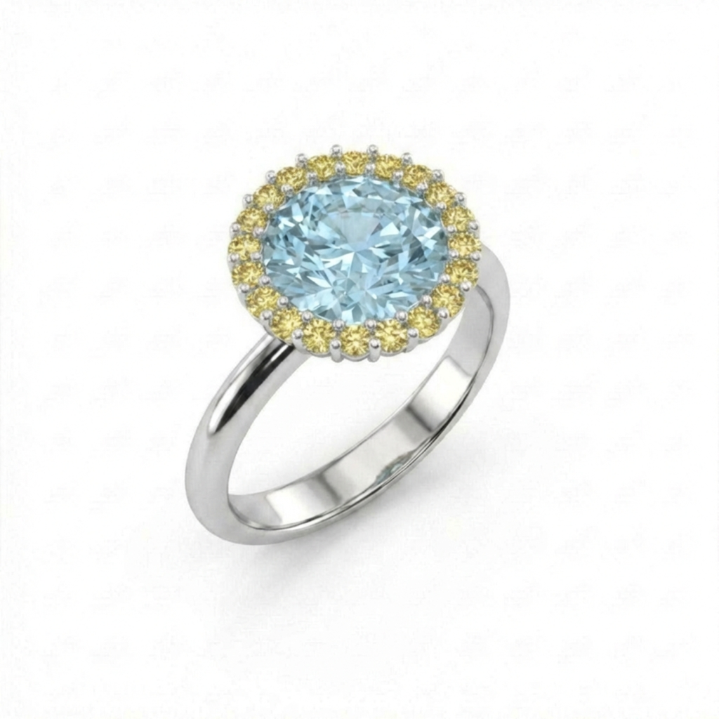
I often pair aquamarine with platinum or white gold to maintain its cool tone. Yellow gold shifts perception and can warm the blue. With diamonds, the pairing remains restrained. With pink sapphires, tension appears — sometimes intentionally.
Emerald cuts, ovals, and structured cushions often suit aquamarine best. Too many small facets can disperse light in ways that reduce perceived depth. Clean geometry supports its nature.
Why I Love to Work With Aquamarine
Aquamarine doesn’t scream for attention. And that’s exactly why I love it.
When a client chooses aquamarine instead of sapphire, I immediately understand something about her. She doesn’t need intensity to feel strong. She wants light. She wants movement. She wants something that feels effortless on the hand.
As a designer, aquamarine gives me freedom. On the color wheel, blue is incredibly intelligent. It sits opposite warm tones, so when I place it next to yellow sapphires, the contrast becomes alive — fresh, clean, confident. Pair it with morganite and something softer happens. The warmth of the blush stone wraps around the blue, and the composition feels balanced without trying too hard. Aquamarine doesn’t overpower. It stabilizes. It allows other colors to breathe.
That is why it works so beautifully in my collections. I can build around it. I can create tension or harmony depending on what I place beside it. And the blue always holds.
There’s also a delicacy to aquamarine that I’m deeply drawn to. Not weakness. It’s durable enough for daily wear. But visually, it feels light — almost architectural in the way it carries transparency. The light passes through it cleanly. It doesn’t trap it. That clarity makes the entire ring feel refined.
When I set a fine aquamarine and see it against the skin in natural daylight, I know immediately if it’s right. The blue should look calm, steady, confident. Not pale. Not gray. Not loud. Just balanced.
I love working with aquamarine because it allows me to design with intention. It gives me control over contrast, proportion, and tone. It makes the whole composition feel considered.
And when someone wears one of my aquamarine pieces, it never feels like decoration. It feels like alignment.